NE Home 2023
April 28, 2023A thoughtful makeover restores a Fairfield home’s architectural integrity.
Text by PAULA M. BODAH
Photography by KEVIN SCOTT
A facelift returned the front façade to a more authentic, symmetrical colonial style. Architect Hannah Robertson added the dormers to the new cedar-shingled roof and traded a fussy portico for a simplified version. Landscape architect Mark Hicks reworked the driveway and front yard to give the home a gracious approach befitting its new look.
Some houses just have a naturally good vibe, even when they’re hardly perfect stand point. Take this 1951 colonial in a leafy Fairfield neighborhood. Over the decades, families had moved in and added bits and pieces, in whatever style was in vogue. By the time its current owners came along, the house sported a mishmash of architectural styles.
Still, the home spoke to the couple. “It had good energy,” the wife says. “It’s clearly been well-loved by everyone who has lived in it, and that energy was really present.”
It was the husband’s idea to call on architect Hannah Robertson, one of his wife’s best friends from college. Robertson had two main goals: to restore the home’s architectural integrity and to create a more cohesive interior floor plan.
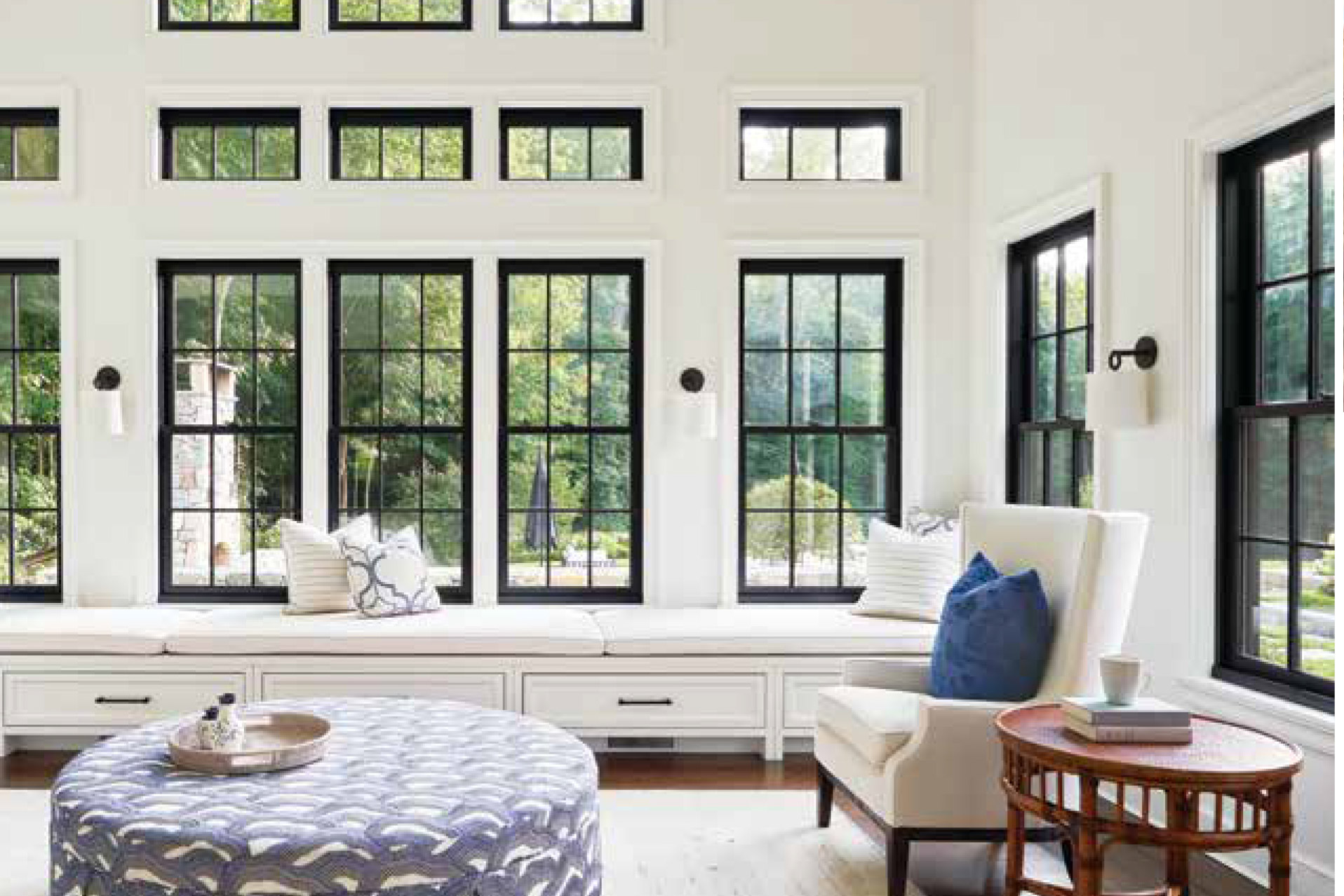
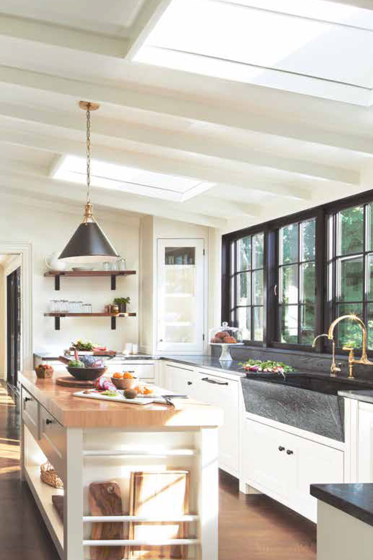
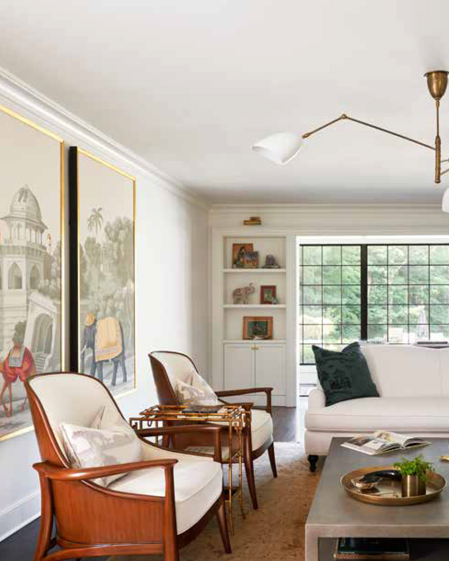
ABOVE: The kitchen’s disparate materials-a soapstone farmer’s sink, butcher-block prep island, and marble counters-are unified by the black-and-white theme. FACING PAGE, TO TOP TO BOTTOM: The wife, who grew up in New England but is of Indian heritage, chose the living room’s hand-painted de Gournay panels. The oversized ottoman, covered in Brunschwig & Fils fabric, often becomes a game table in the sunroom, a favorite family gathering spot.
“WE kept the scheme really classic, so it ties in with the architecture.”
-Interior designer Ali Vanderpool
On the exterior, she peeled away extraneous details, replacing circular windows with rectangular, black framed versions and removing the shutters. The blocky, molding-heavy roof of the front portico gave way to a simple peak, and plain columns stood in for the old fluted ones.
Landscape architect Mark Hicks, meanwhile, reworked the approach, laying a new driveway that curves gracefully between a pair of stone walls and puts the focus on the pretty new entrance. As for plantings, he says, “What was there was a bit tired and not well-detailed.” Now, the front yard sports a quietly elegant look, with a semiformal border of boxwood accented with flowering shrubs and perennials for seasonal color.
Inside, Robertson rejiggered walls for a more natural flow that gives every room a view to the outdoors. “She loves a traditional approach,”

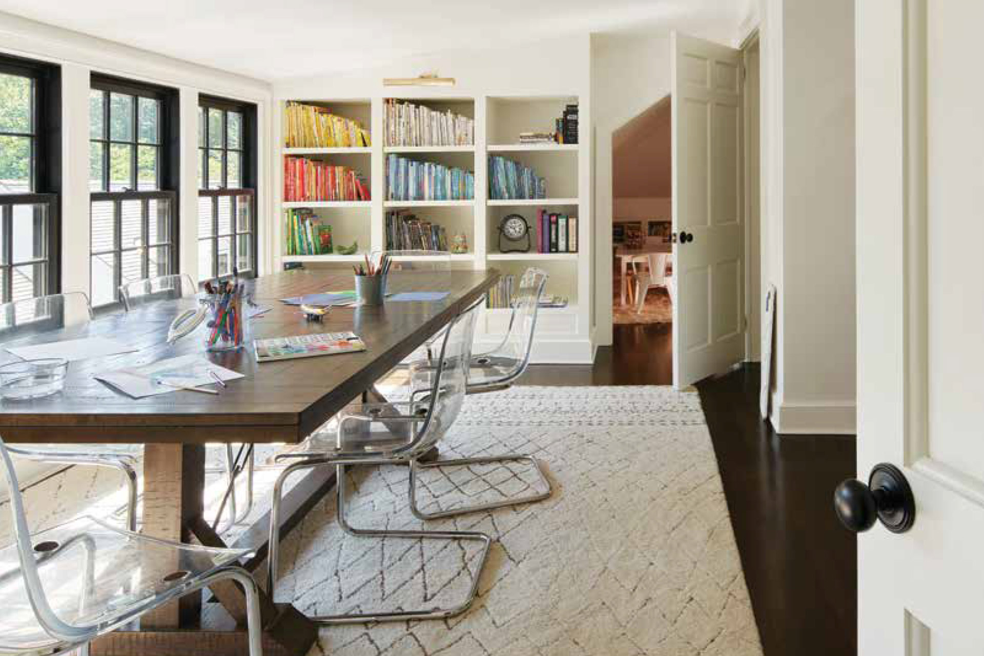
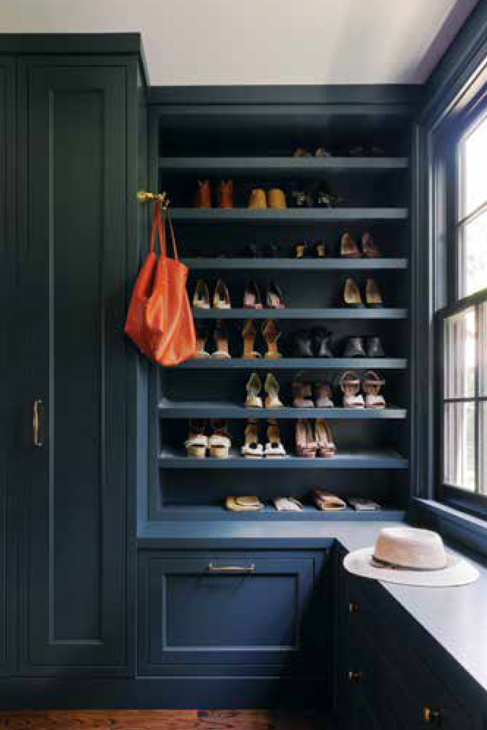
ABOVE: the wife’s office occupies what used to be one of the his-and-her bathrooms. The couple’s bedroom is outfitted in more formal paneling and painted in rich French Gray from Benjamin Moore. The wife’s close, painted in Benjamin Moore Yorktowne Green, is her special enclave. “It makes me so happy!” she says. FACING PAGE: The unfinished third-floor attic is now a spacious activities area for the kids. The Tobias acrylic chairs from IKEA sit on a Moroccan-style rug that came from the family’s previous home.
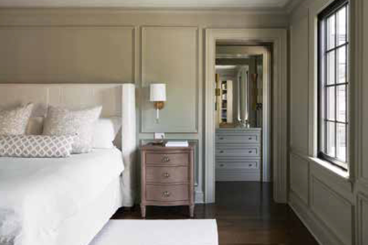
Robertson says of her client, “but she wanted a looser, more open interior.”
As she did with the outside, Robertson edited the interior architecture for a clean, consistent look. “There were seven or eight different profiles of trim detailing and paneling,” she explains. “We picked two to use throughout; it lets you see the big picture instead of being distracted by details.”
Designers Ariana Villalta (another
“IT had good energy,” the homeowner says. “It’s clearly been well-loved by everyone who has lived in it, and that energy was really present.”
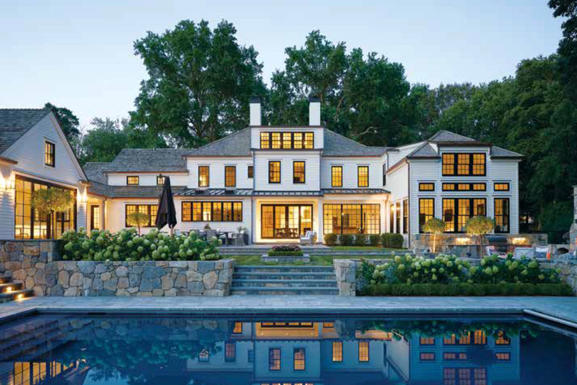
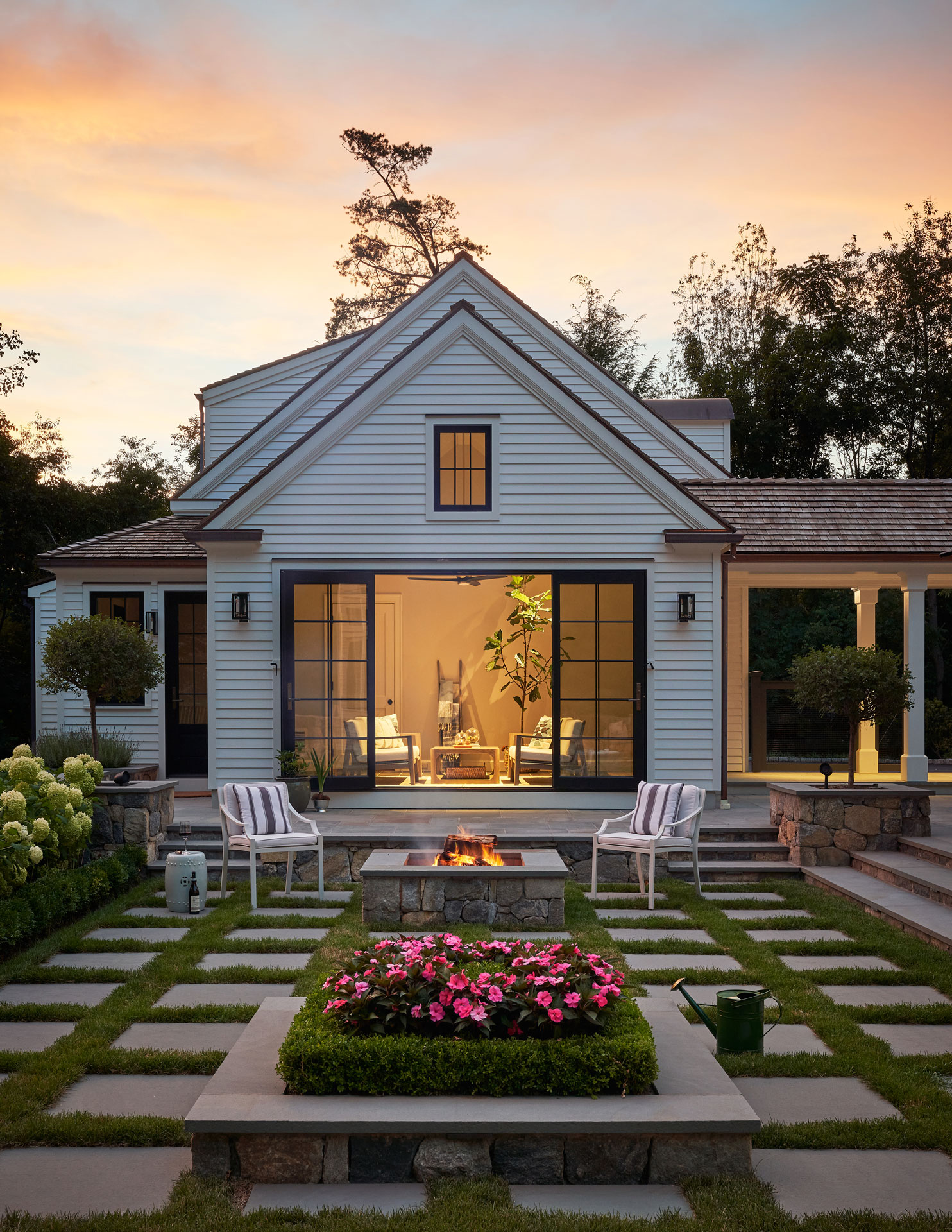
ABOVE: The old backyard was nothing more than a sloping expanse of lawn. Mark Hicks regraded the property to create a series of terraces that step down to the swimming pool. Hick’s colleague Agnes Kacperczyk selected all the JANUS et Cie outdoor furniture. FACING PAGE: The geometric design of the firepit area echoes the geometry of the house. Hicks used the grass and flowering plants to soften the straight lines.
PROJECT TEAM
Architecture: Hannah Robertson, Hannah I. Robertson Architecture
Interior design: Ariana Villalta and Ali Vanderpool, The Elegant Abode
Builder: Tallman Segerson Builders
Landscape design: Mark Hicks, Elise Landscape &” Nursery
Longtime close friend of the homeowner) and Ali Vanderpool brought a light touch to the interiors. “The whole house is centered around the outside,” says Villalta, “so we wanted to keep the inside simple in terms of lighting and décor.”
“We kept the scheme really classic, so it ties in with the architecture,” adds Vanderpool. In the public spaces, from the living room to the sunny family room to the kitchen, the palette is simple as well, with accents of blue against a backdrop of Benjamin Moore White Dove.
The homeowners, parents to a teenager and two grade-schoolers, are delighted to be next in a long line of people filling the house with joy. All the old house needed, it seems, was one more family to love it.
